
BRAND COLOR
-
#1E3B1D
-
#070506
-
#99D1B8
NAMING
모스MOSS 우드WOOD
모스(이끼)는 태초의 식물입니다.
지구가 탄생할 때부터 존재했던 선태식물로 육상식물로 진화하는 식물의 근원입니다.
이끼로 뒤 덮인 숲처럼 MOSS WOOD는 생명력 넘치는 기획으로 끊임없이 발전하며 사회에 기여하는 마음을 담은 이름입니다.
SYMBOL
이끼 MOSS
이끼들이 하나 둘씩 모여 숲을 이루는 것을 형상화했습니다


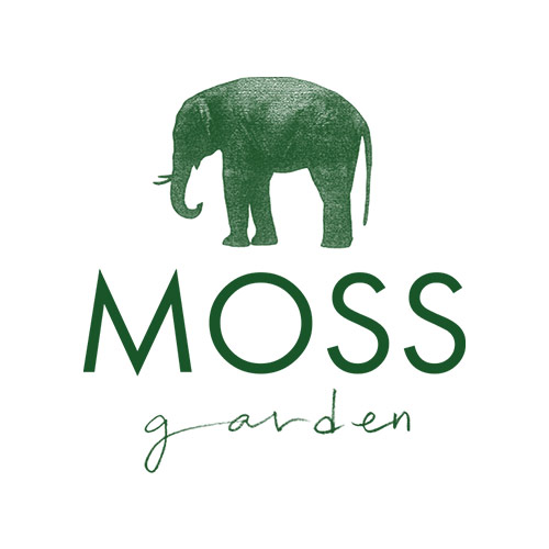
BRAND COLOR
-
#1E542C
-
#EA4D2E
NAMING
모스가든
모스(이끼)는 태초의 식물입니다.
이끼가 풍성한 푸르른 정원을 뜻하기도 하지만 ‘모세의 정원’이라는 뜻으로 모든 사람이 행복해지기를 바라는 마음으로 네이밍했습니다.
SYMBOL
코끼리 Elephant
육지에 사는 동물 중 가장 몸집이 크면서도 초식동물인 코끼리는 성숙한 암컷이 이끄는 가족 단위로 생활을 합니다. 모스가든은 서로 사랑하는 마음으로 함께 살아가는 커다란 코끼리처럼 많은 사람들을 수용하며 ‘상생’하기 위하여 코끼리를 심볼로 했습니다.

BRAND COLOR
-
#D82430
-
#13284A
NAMING
Samaritan
팔레스타인의 사마리아 지방에서 살던 종족으로 성경에서 ‘선한 사마리안’으로 등장 하는데 당시 유대인들이 경멸하던 혼혈민족입니다. 요한복음에는 예수가 우물가에서 사마리아 여인과 대화를 나누는 장면이 나오는데, 이는 곧 편견과 차별을 하지 않았다는 뜻을 암시합니다. 강도를 만나 쓰러진 사람을 모든 사람은 외면해도 이방인이었던 사마리아인만 도움을 주죠. 이제 웰빙이나 유기농, 좋은 식자재는 당연한 일로서, 이제 선한 이방인들이 함께 모여 ‘상생’하는 마음으로 좋은 식자재를 사용하여 레시피를 만들고자 이름을 지었습니다.
SYMBOL
Calligraphy
붓글씨 터치의 캘리그라프로 자연스럽고 활기찬 이미지로 디자인했습니다. 서양 재료인 올리브 잎과 동양 재료인 대파를 같이 넣어 건강하고 자연친화적인 이미지를 불어 넣었습니다. 붉은 피를 뜻하는 레드 컬러를 사용하였습니다.
BRAND COLOR
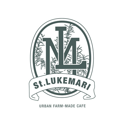
-
#36544E
-
#D93330
NAMING
ST. LUKE/ 누가; 누가복음은 작가, 화가, 의사
누가는 4대 복음서의 저자이며 사도행전의 저자라는 추측도 있습니다. 다른 제자들에 비해 알려진 것은 없으나 사도 바울과 함께 여행할 때 바울이 ‘사랑받는 의사 누가(골로새서 4: 14)’라고 말했고, 감옥에서 쓴 서신에서는 충실한 동료였다고 말했습니다. (디모데후서 4: 11)누가는 마리아의 초상화를 그린 화가여서 화가들의 수호성인으로 불리며 지금까지도 ‘성 누가 아카데미’라는 명칭의 미술학교가 많다고 합니다.
St.Lukemari생루크마리는 의사이자 화가 등의 직업을 가진 누가의 이름에 치유의 로즈마리의 ‘Mari’라는 단어를 접목시킨 이름입니다.
There is a speculation that Luke was the author of the Four Great Gospels and the author of Acts. Compared to other disciples, Luke wasn’t well-known but according to Baul, Luke was a doctor who was loved by many people (Colossians 4: 14) and in his letter in prison, Baul said that he was a faithful companion (II Timothy 4: 11)
It is said that Luke was a painter who painted portraits of Mary and there are still many art schools named as St. Luke academy.
Saint Lukemari is a name that combines Luke’s name who was a doctor and an artist with the word ‘Mari’ from the healing rosemary.
SYMBOL
로즈마리 Rosemary
로즈마리 잎이 연상되는 그린 컬러를 사용하였고, 이파리와 LM이니셜이 겹쳐지게 하여 클래식 바이블을 연상시키는 리본 테이프에 브랜드 로고를 넣었습니다. 화가이기도 했던 누가를 생각하며 마치 그림과도 같은 심볼로 디자인했습니다.
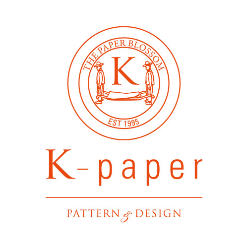
BRAND COLOR
-
#E9470E
NAMING
K-paper
이 회사의 모체인 ‘꽃피는 봄이오면’의 영어 kkotsbom의 ‘K’를 상징하는 동시에 그래픽 디자이너인 Kim Hae Jin의 이니셜, ‘Korea’, 꽃의 한국어 발음인 Kkots의 ‘K’를 뜻합니다. 그런 이유로 K-paper는 다양한 꽃패턴이 많습니다.
SYMBOL
paper & people
K-Paper는 다양한 종이를 기본으로 패턴과 디자인을 하는 브랜드로서, 심볼은 종이를 운반하는 짐꾼입니다.